Nedonošenček.net
Društvo za prezgodaj rojene otroke needed a website that actually worked for the people using it. Donors who wanted to donate, and parents of premature babies who needed information.
Starting Point
The existing site was outdated in both structure and usability. Key information was hard to find, the site loaded slowly, and the navigation made it difficult to get anywhere quickly.
The two main user groups were donors (A) and parents of premature babies (B) but neither could reach their goal without friction. Donating took too many clicks, and parents were hunting for information across external forums or buried in walls of text.

Problem Solving
The goal was to improve the user experience, make the transition to the new site seamless, and give the organisation full control over managing their own content. No technical knowledge needed.

Implementation
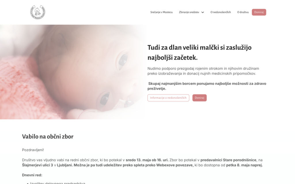
I separated the site structure around the two user types (A and B), which immediately made navigation more intuitive for both groups. Related content was consolidated, less critical information was moved to its own subpages so it didn’t clutter the main flow, and the external forum was replaced with integrated contact forms. Donation campaigns and fund usage are now displayed cleanly and are easy to update.
Results
The site saw more visits, more donations, and more enquiries from users. In 2026, the organisation received donations in the first week of January alone. Noticeably earlier than in previous years.